Use white space.
When information is too densely packed, your data visualization can feel overwhelming and unreadable. You can make your visualization clearer by leaving a gap between sections of a chart. This can also supplement accessible color choices by helping users distinguish the difference between colors that identify separate sections.
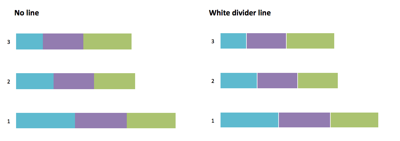
Example of an effective use of white space from Amy Cesal’s Accessible data viz is better data viz.